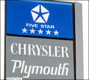
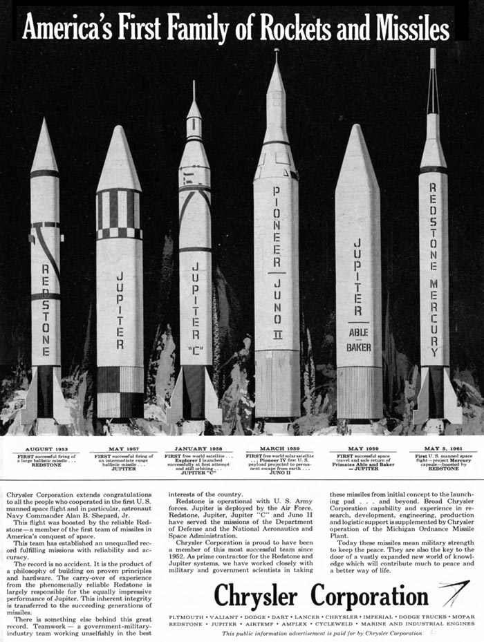
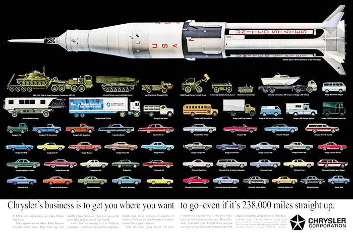
One of the hallmarks of Lynn Townsend’s leadership in the 1960s was marketing the company as a whole. Much of this came out of the new Corporate Identity Office, created by Townsend in 1962, which later published ads showing the full lineup from Valiant to moon rocket and a history book showing key cars from each brand (though not trucks).
Chrysler had previously used one of the symbols of Virgil Exner’s “Forward Look”—a pair of linked angles possibly also representing rockets—as its corporate symbol, but only on cars—and in any case its dual use as Forward Look and Chrysler corporate logo had dated the symbol, shown above at a somewhat unusual angle.
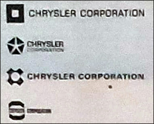
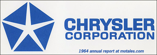
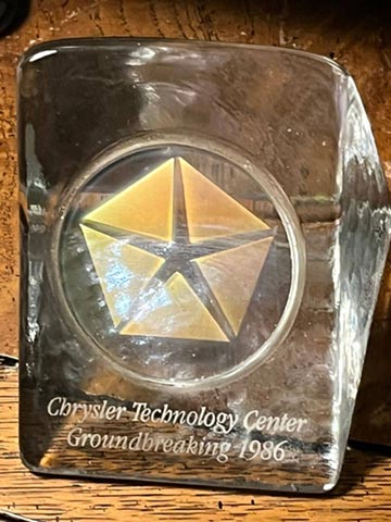
Chrysler asked the design firm Lippincott & Marguiles to create a logo for the entire corporation. The firm provided 800 proposed designs, avoiding both ovals (which Ford basically owned) and words. They did not want to use the company’s name because of possible confusion between Chrysler-the-company and Chrysler-the-marque—and because they were expanding into countries with different alphabets. That left shapes and forms, including a broken-up pentagon created by account executive Robert Stanley, who also specified its trademark blue color.
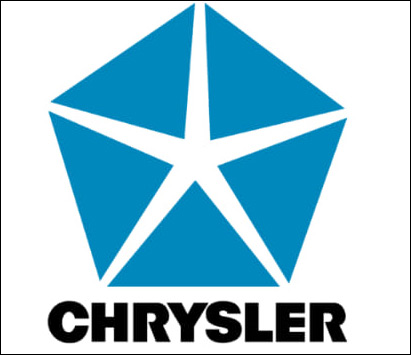
Stanley said that he deliberately named the pentastar to prevent it from getting a derogatory name; a circular logo he had made for another company had been dubbed “the meatball,” which he did not appreciate.
Stanley said he had wanted a logo that was memorable “and still [has] a very strong, engineered look to it.” It should not be easy to draw freehand—it should look engineered—despite its classic shape, which is why the parts weren’t joined at the points. In addition, Stanley felt that breaking up the pentagon created “tension and a dynamic quality.”
Chrysler later claimed in a press release that “Townsend wanted a symbol with a strong, classic look that would be instantly recognizable, but was universal—without written words—allowing it to be used in all countries and across many cultures.”
Though it may have been the most memorable part, the pentastar was just one part of an overall corporate identity effort which, again, included history books, listings of divisions at the bottom of ads, and the famed “whole company” ad.
Adopted in 1962, the Pentastar appeared in ads for the 1963 cars and was even embossed onto the front cover of the 1962 Annual Report. On the back cover, it was printed in a deep blue.
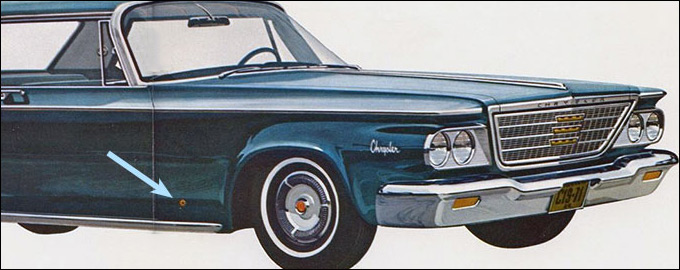
During the 1963 model year, the company started phasing in pentastar emblems behind the right front wheels, where they would stay for many years. For cars made before the factory put them in, the company sent each dealer one medallion kit for each 1963 car they had gotten.
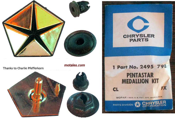
The dealership was supposed to drill two holes into each car; while the second pin in the back of the logo piece was mainly to orient it in the correct direction, it also provided a little extra grip (they were not glued on). Not all dealers actually installed all of their trim pieces, mainly since customers had already taken some of the cars home, so even today 1963 cars might or might not have a pentastar.
The familiar Pentastar-headed keys started with the 1964 cars and ended with modern security keys; early security keys had a pentastar in the plastic piece holding the key’s radio.
The company stopped mounting pentastars on the passenger-side fenders (they did not go on the driver’s side) during the 1980s, then returned briefly during a resurgence of pride in the 1990s, ending during Daimler’s ownership.

Stanley, the symbol’s creator, implied that the pentastar had five parts just to make a shape of the right complexity, and the other finalists suggest that was the case. However, Chrysler’s opening to the 1963 season of the Bob Hope Show showed the five segments of the Pentastar moving into place with engine sounds, as different marques were called out—Plymouth, Dodge, Chrysler, Imperial, and Dodge Truck. That caused many to think the five segments represented those brands; but the ad agency likely just applied artistic license. Globally, Chrysler had many more brands. Even in the United States they had a military/aerospace division, Huntsville electronics, power boats, sailboats, industrial and marine engines, Airtemp, Amplex chemicals and plastics, and so forth. Stanley himself said the five parts had no meaning at all.
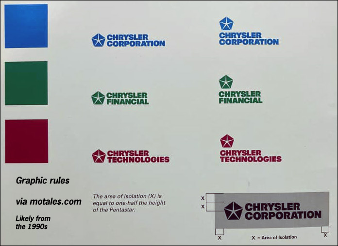
In 1996, the company’s new headquarters in Auburn Hills included an office tower crowned by a two-story-high glass Pentastar.
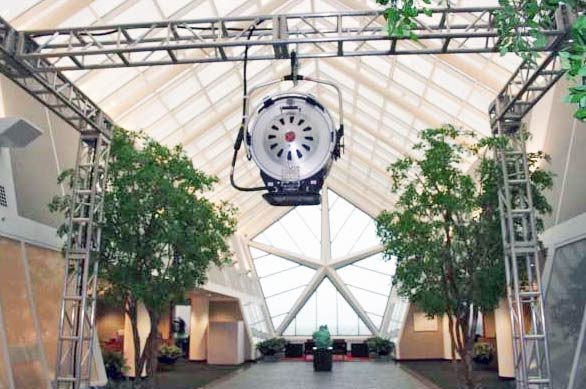
The company was taken over just two years later by Daimler-Benz, as its leader and board committed corporate suicide (or murder). Daimler immediately took out the pentastar as removed as the corporate symbol; rumor claims they demanded the pentastar be removed from the office tower, but balked at the cost and left it there.
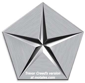
As though to celebrate Daimler’s departure, head designer Trevor Creed redesigned it in 2007, the year Daimler gave the former Chrysler to Cerberus. Creed created a “3-D” look, added a “brushed metal” texture, and changed the ends of the five triangles to enclose the star, claiming this “added a sense of solidity that gave the star shape a much slimmer, high-quality, precise appearance.”
Sales chief Steven Landry wrote that, “The Pentastar represents all the pride that employees feel ... and the confidence we have in our new direction.” He pointed out that even under Daimler, it “literally towered over the company and employees [on top of the CTC].” However, the pentastar did not remain the corporate symbol for long; and even during this brief respite, around 2007 to 2009, it was not placed onto dealership signs.
Sources: Chrysler Times, company press releases, personal observations, annual reports, interviews
Copyright © 2021-2025 Zatz LLC • Chrysler / Mopar car stories and history.
YouTube • Editorial Guidelines • Videos
Tailfins Archive • MoTales on BlueSky